“Daniels Construction”
Business Card based on a mock business. The Logo was created by us in addition to the overall design of the card.
We wanted to create a simple to-the-point business card that, while maintaining its simplicity, still has the theming of a construction business.

The Logo
Built from the fusion of two things. The letter d and a pair of pliers. This fusion was deemed appropriate due to its relation to the subject matter of construction. The pliers were carefully placed inside the d while the ascender of the d is made to look like a pair of clamps to further the construction narrative.
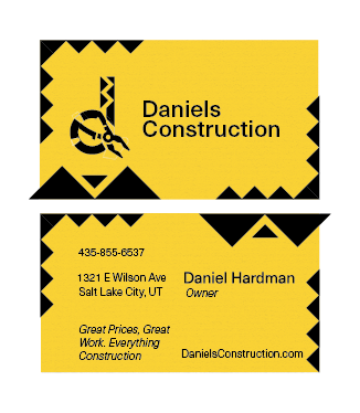
The Card
Features a custom Logo as well as a “rocky” feel to it. Meant to look tough, as you would want your construction to look like. Has all the necessary information listed for proper contactin,g making it serve its purpose perfectly.